
1º “Harness” by Kanstantsin Fatseyeu
This image feels like raw inner energy crystallised in light: a dense, almost volcanic core of golden shards explodes diagonally through the frame, surrounded by darker, cooler areas that work as a stage for that eruption of power. The movement is complex but not chaotic: you can read a path, a twisting trajectory that matches the idea of an inner force that has had to fight its way out through doubt, friction and resistance. Technically it’s extremely refined for a single exposure—there’s layering, depth, micro-textures and a very careful balance between highlights and shadows, with color grading that reinforces the emotional arc rather than just decorating it. Conceptually, the photograph supports the artist’s text: it speaks of an arduous process of self-mastery, of something luminous that has been forged rather than gifted. As a whole, it sits comfortably among the strongest abstract works we’ve seen this year.

2º “Image#1” from Digigrams Series, by Tommy Goguely
This image turns the “failure” of the digital sensor into a precise, almost architectural abstraction: a dense block of chromatic noise, sliced into razor-thin vertical and horizontal lines, hangs in an ocean of white space and then cascades downward like a digital waterfall. The tension between emptiness and hyper-information is very strong, and the geometry is composed with real discipline—nothing feels accidental, even though the source is mechanical damage and malfunction. Conceptually it’s one of the most sophisticated works: the camera no longer records the outside world but its own wounded surface, becoming both subject and medium at once. That self-referential loop, combined with the clean, hard-edge visual language, is exactly the kind of experimental stance many contemporary juries want to reward.
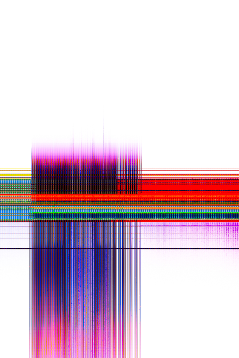
Used here for critical commentary in a non-commercial context.
3º “Image#1” from Extented Series, by Matt Vacca
This image feels like a perfectly controlled whisper. Three continuous volumes grow out of each other like a single breath of matter, suspended in a soft, velvety grey space. The lighting is surgical: just enough gradient and rim to carve the forms, without any distraction, so the viewer’s eye travels slowly from base to top, reading the piece as a totem of balance and tension. Conceptually it sits in that interesting zone between an everyday object, a digital sculpture and a psychological portrait, which fits the idea of “rhythm and balance in ordinary things”. It’s not explosive or sentimental, but it has a very high level of refinement and a calm, confident presence that absolutely justifies a top-tier placing.
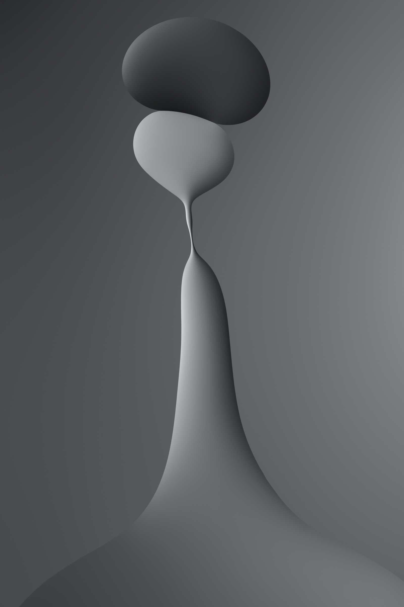
Used here for critical commentary in a non-commercial context
4º “Image#1” from Look a Little Closer Series, by Bevil Templeton-Smith
This image works like a chromatic waterfall: the red–orange “ribbons” surge upward and then dissolve into a deep, cooling blue, creating a very strong directional flow from lower right to upper left. The micro-crystal subject completely disappears as referent, de-scaled into pure gesture and colour, but the optical sharpness of the polarised light keeps everything tactile and believable, so it doesn’t feel like generic digital painting. Conceptually, the project text refines it further: revisiting the same slides like a landscape through the seasons gives the work a quietly obsessive, research-based dimension that many abstract photographs lack. It may not have the narrative punch of the top 3, but as a fusion of painterly impact, rigorous craft and a genuinely fresh microscopic world.

Used here for critical commentary in a non-commercial context
5º “Image#1” from Chromatic Wounds Series, by Popa Gheorghe
Seen from above, the toxic lagoon becomes a circulatory system: turquoise channels function like arteries irrigating a golden “body,” but we know from the text that what flows is not life, but mining waste. The visual map is hypnotic—a blend of river delta, roots, and neural tissue—with a very clear “Y”-shaped composition that guides the eye across the entire frame without any blind spots. The palette (cool blues against warm, polluted ochres) does exactly what the project promises: it seduces at first and then unsettles when we understand what we are looking at. The combined use of drone and ground-level camera gives depth to the Poisoned Beauty project, placing this image in the upper echelons of the year’s Top 5 for its balance between formal beauty and ecological denunciation.

Used here for critical commentary in a non-commercial context
6º “Image#3” from Take a leap Series, by Frances Fujii
Frances Fujii’s series stands out for its bold and unconventional approach to wildlife photography. The black-and-white, high-contrast style, combined with intentional motion blur, gives the images the appearance of charcoal drawings. The effect is reminiscent of the tonal style of artists like Georges Seurat and Käthe Kollwitz. This minimalistic treatment is not often seen in wildlife photography, making the work both distinctive and memorable.
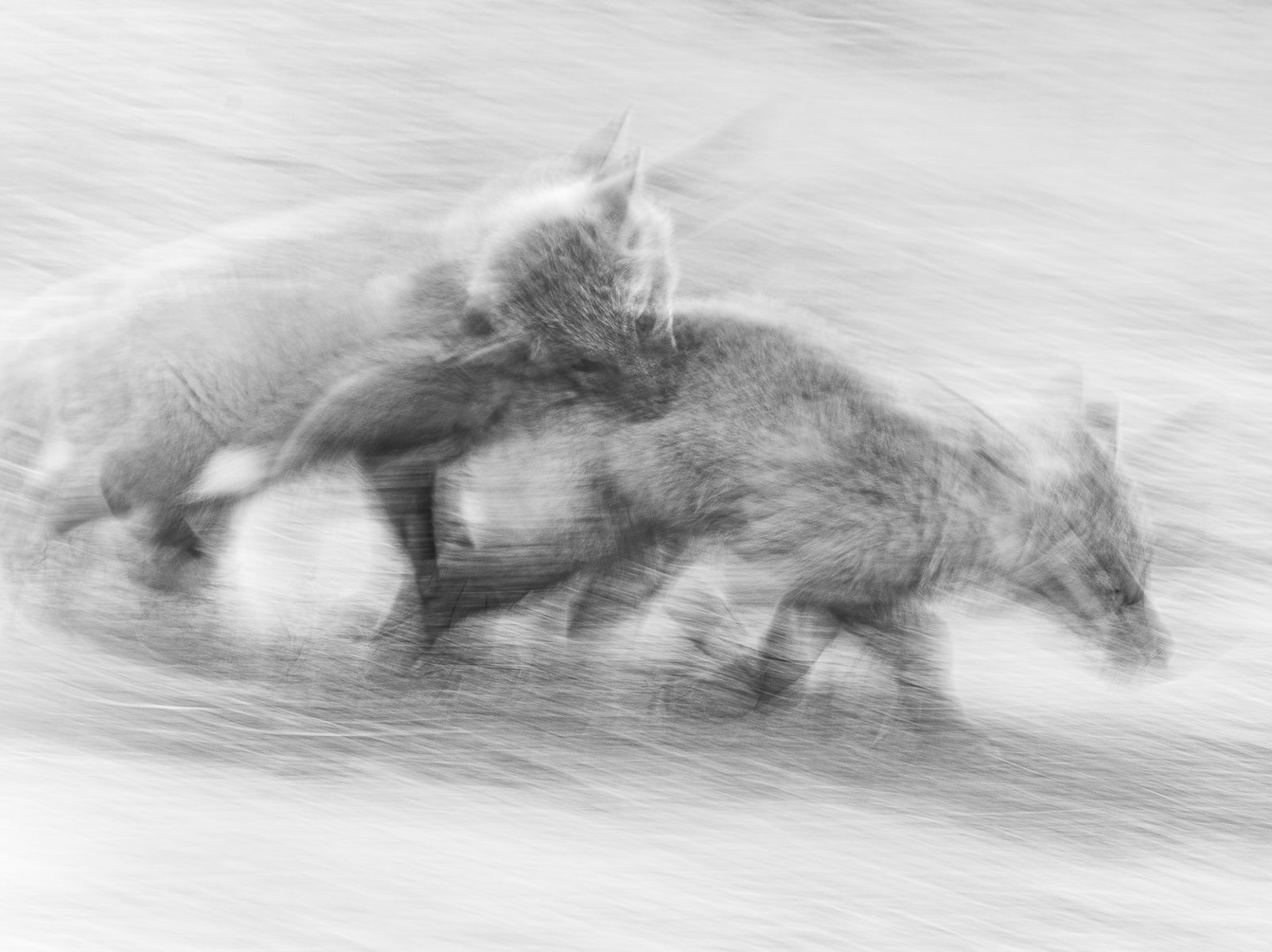
Used here for critical commentary in a non-commercial context
7º Image#1 from Everything is wrong, by Mark Tamer
The diptych functions as an autopsy of the photographic medium itself: on the left, a spectral figure almost erased by grain; on the right, the frame invaded by fungi that paint an organic forest on the emulsion. The band of perforations in the center is the “spine” that reminds us we are looking at film/photography, not just a ghostly scene. The gesture of letting time, chemistry, and mold collaborate with the artist makes the medium itself the protagonist: the image speaks of damaged memory, of decomposing bodies and recollections. It doesn’t have the immediate visual impact of the more chromatic works in the ranking, but its conceptual layer and its way of making decay its own language place it very high in experimental abstract photography.
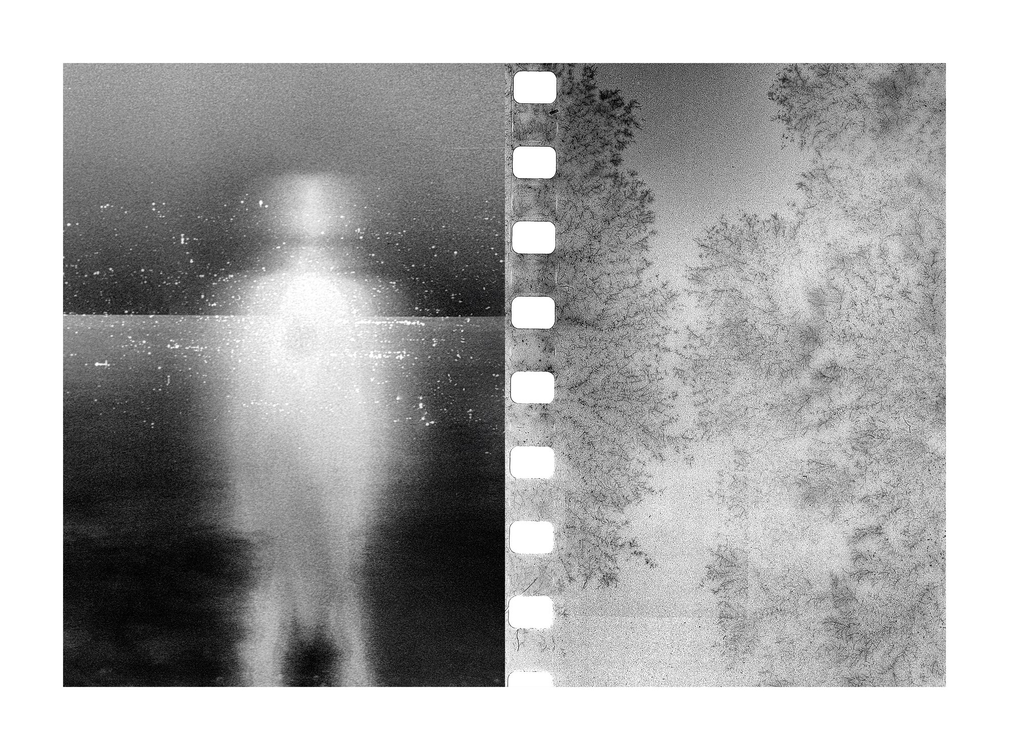
Used here for critical commentary in a non-commercial context
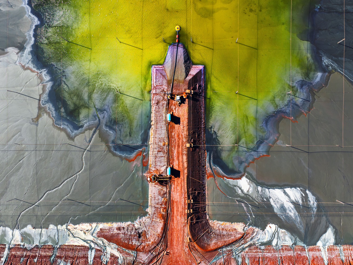
8º “Bonsay” by Mark Gray
The photo works brilliantly as an aerial abstraction: the red tongue of the dam enters from below like a tree trunk, the yellow and green branches sprouting from the “trunk” are literally interpreted as a bonsai canopy or a vascular/neural system. The vertical symmetry is very well controlled without becoming rigid, and the contrast between the toxic green, the flat grays of the mud, and the orange rust creates an immediate reading between beauty and industrial pollution. Conceptually, it is more “classic” than Chromatic Wounds (which has a more elaborate environmental narrative), but visually it is among the year’s elite: impeccable composition, devastating color, and an abstraction that holds up even if you don’t know it’s a mine.
Used here for critical commentary in a non-commercial context
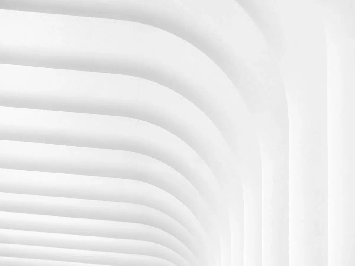
9º “Graceful Curves” by Paul Lehane
“Graceful Curves” is an almost clinical example of geometric minimalism: a family of parallel curves, slightly open and off-center, creates a stepped depth that guides the eye from bottom left to top right. The light is masterfully distributed: on the left, a range of very light whites and grays dominates, while on the right, the exposure drops into a dense penumbra, creating a tonal asymmetry that adds tension to the composition. Each arc is modeled with fine micro-contrast—a luminous bevel above, a soft shadow below—so that the volume is perceived without halos or harshness. Compositionally, the image combines regular repetition and controlled asymmetry, making it musical rather than rigid. Technically, it borders on perfection, and although its concept remains on formal and “safe” ground, it stands as a solid reference point for minimalist abstract photography.
Image © Paul Lehane, Minimalist Photography Awards 2025.
Used here for critical commentary in a non-commercial context.
Full image: Minimalist Photography Awards 2025.
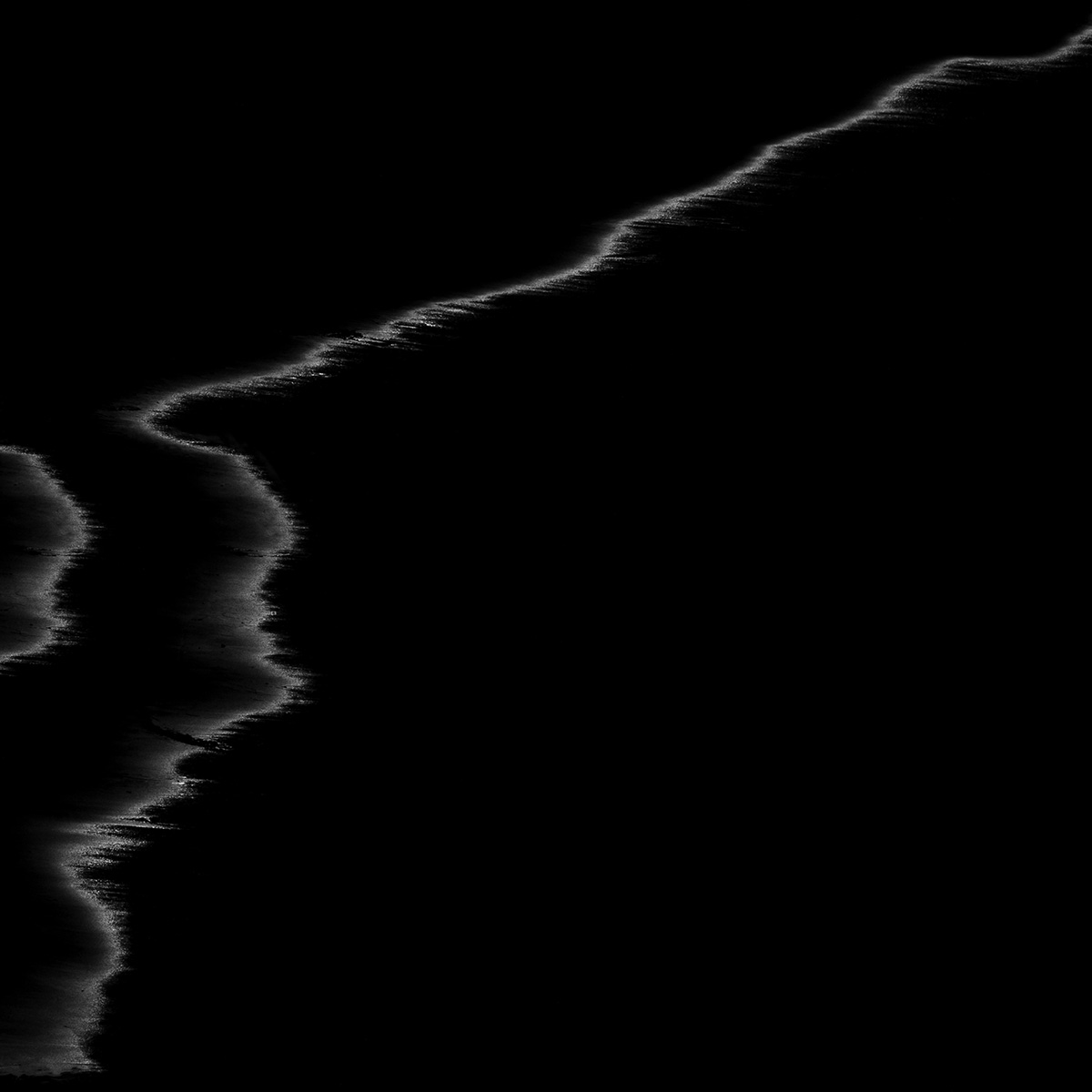
10º “Image#1” from Estero Series, by Jacques Garnier
Visually, it’s a very radical piece: almost everything is absolute black, and all the weight rests on that broken line of foam that enters from the bottom left and vanishes diagonally toward the top right corner. Ma’s philosophy is clear: emptiness isn’t background, it’s the protagonist; the “subject” is the distance between the edges of light. The composition is impeccable in terms of rhythm and tension, almost calligraphic, and technically there’s remarkable control of contrast and just the right amount of detail at the luminous edge. Weak points: the concept isn’t particularly original within coastal minimalism, and part of the impact relies heavily on the explanatory text; without that context, some jurors might see it as “too empty” but they will be wrong.
This ranking is personal but not subjective; it doesn’t list my 10 favorite photos, but rather those I consider the best based on various criteria. I also tried to include the widest possible variety within the context of exceptional quality.
Five Masters of Pure ICM (abstract school)

Leave a comment