
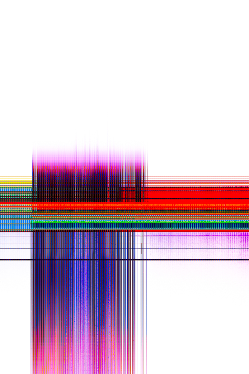
1º Digigrams by Tommy Goguely
This series turns technical malfunction into subject matter. By physically scratching, drilling and damaging the digital sensor, the artist forces the camera to stop recording the outside world and to document only its own collapse. The usual invisible medium becomes a visible, wounded surface, generating bands of neon colour, glitches and blocks of distorted pixels. Each image is a self-portrait of the device, a diagram of its progressive destruction rather than a window on reality. Visually, the work moves between dense, vibrating grids of magenta and blue, hard geometric blocks on black, and explosive gradients of yellow, green and pink. Lines and rectangles echo the internal architecture of the sensor, while noise and speckles reveal its electronic grain. Together, the photographs feel like contemporary abstract paintings made of pure data, questioning what remains of photography when the subject disappears and only the medium itself is left to speak.
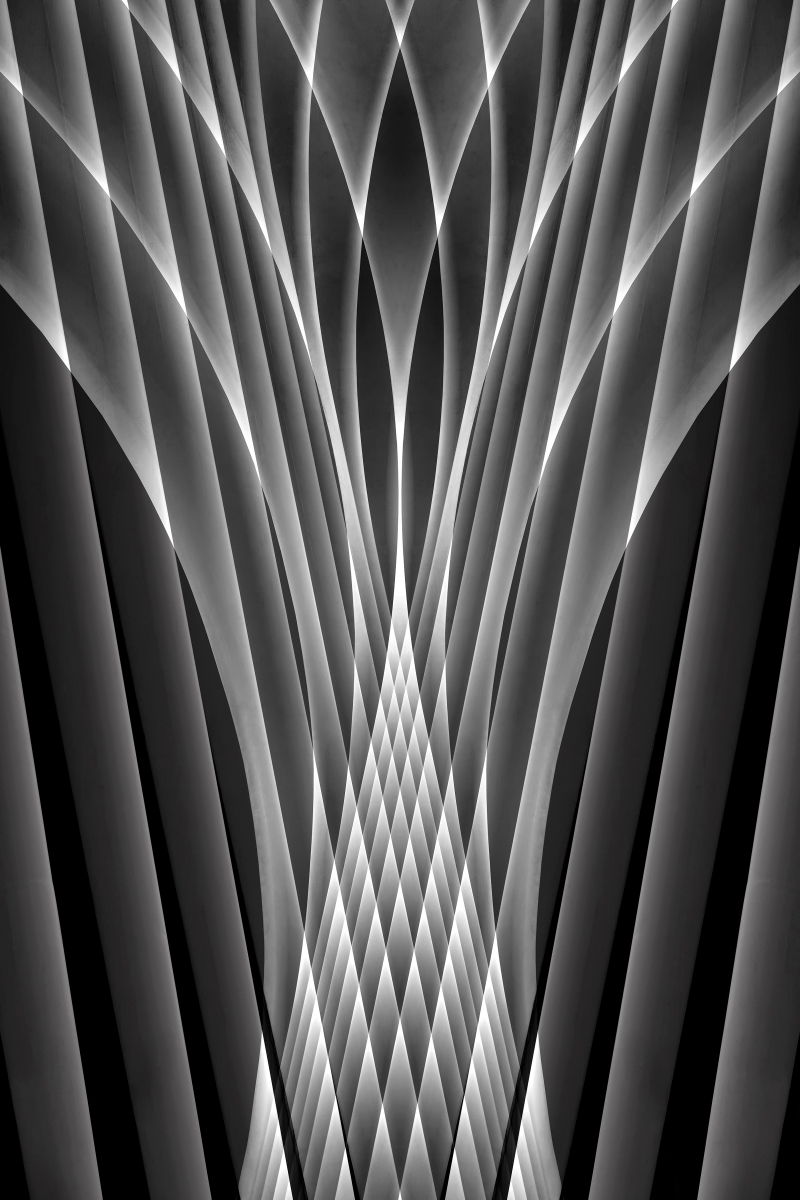
2º Echoes in Contrast by Louis-Philippe Provost
Echoes in Contrast transforms Santiago Calatrava’s Oculus into a laboratory of pure geometry. Starting with the same structure—the building’s white ribs—Louis-Philippe Provost constructs a series of black-and-white variations based on symmetry, reflection, and digital layers. By duplicating and mirroring the original image, the architectural lines multiply to form impossible vaults, almost textile-like patterns, and beams of light that intersect at the center of the frame, dissolving the literal reference to the building. The series maintains a highly coherent aesthetic—the same gray tones, controlled contrast, and absence of extraneous elements—while each photograph explores a distinct combination of rhythm, density, and direction of lines. Thus, architecture ceases to be a place and becomes a mental pattern: a repeated echo of form and light that transforms this New York icon into a collection of abstract cathedrals, somewhere between futuristic and almost spiritual.
3º Chromatic Wounds by Popa Gheorghe
“Chromatic Wounds” is one of the most compelling eco-abstract series of 2025. Shot in Geamăna, Romania, it turns a poisoned mining landscape into a vascular map of nature’s trauma. Branches of turquoise water and canals cut through fields of yellow, orange and rust, like arteries infected by heavy metals. The palette is extremely cohesive: teal–gold–ochre variations repeat across the series, creating a seductive but unsettling chromatic harmony. Compositions rely on dendritic structures, strong diagonals and large sweeping curves, giving each image a clear internal rhythm. Some frames open to epic, cartographic views; others move closer, revealing textures that feel almost painterly or microscopic. The mix of aerial and ground-based viewpoints enriches the narrative, shifting constantly between geography and anatomy. Beauty is used deliberately as a trap: the images attract you first, then force you to confront the toxicity behind their colors. As a chapter of the long-term project Poisoned Beauty, the series stands out for its visual consistency and conceptual clarity. It is a rare case where environmental documentation and high-level abstract photography truly coincide.

4º Look a Little Closer by Bevil Templeton-Smith
This series turns microscopic reality into something that feels monumental and atmospheric. Using polarized light on crystal slides, the photographer creates flowing, plume-like structures where color behaves almost like temperature: deep blues and reds reading as dense, compressed energy, while citrus yellows and magentas open into radiant, airy spaces. Across the images there is strong cohesion of gesture — always an upward, fountain-like movement — so the eye travels in waves rather than getting stuck in any single detail. The chromatic transitions are extremely refined, from smooth gradients to razor-sharp edges where hues collide, which gives each frame both softness and bite. Conceptually, the work succeeds in suspending scale: we could be inside a feather, a nebula, or a field of flames, and that ambiguity is precisely the point. At the same time, the insistence on the photographs being “real” — not digital paintings — anchors the project in a very specific material practice, closer to scientific imaging turned inside out. As a whole, the series offers a coherent visual language of velocity and bloom, while allowing enough variation in palette and structure for each image to contribute a distinct micro-world to the larger continuum.

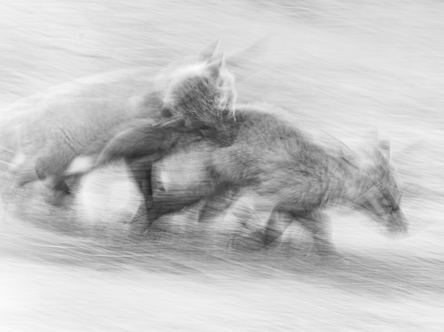
5º Take a leap by Frances Fujii
Frances Fujii’s Take a Leap turns wildlife into pure gesture and atmosphere. In these black-and-white images, foxes dissolve into streaks of light and shadow, as if drawn with soft charcoal over finely textured paper. The grain and diagonal motion blur create a vibrating field where fur, grass, wind and speed merge into one surface. Rather than freezing animal behaviour, the series captures tension and instinct in transit – the instant before a leap, the chase, the hesitation. Compositions stay remarkably clean: large areas of pale tonality are cut by darker silhouettes that guide the eye in sweeping arcs across the frame. The cohesion of the set comes from this shared palette of soft greys and velvety blacks, and from a rhythm of repetition and variation in the poses of the animals. It is wildlife ICM pushed toward drawing and poetry, where emotion and movement matter more than anatomical detail.
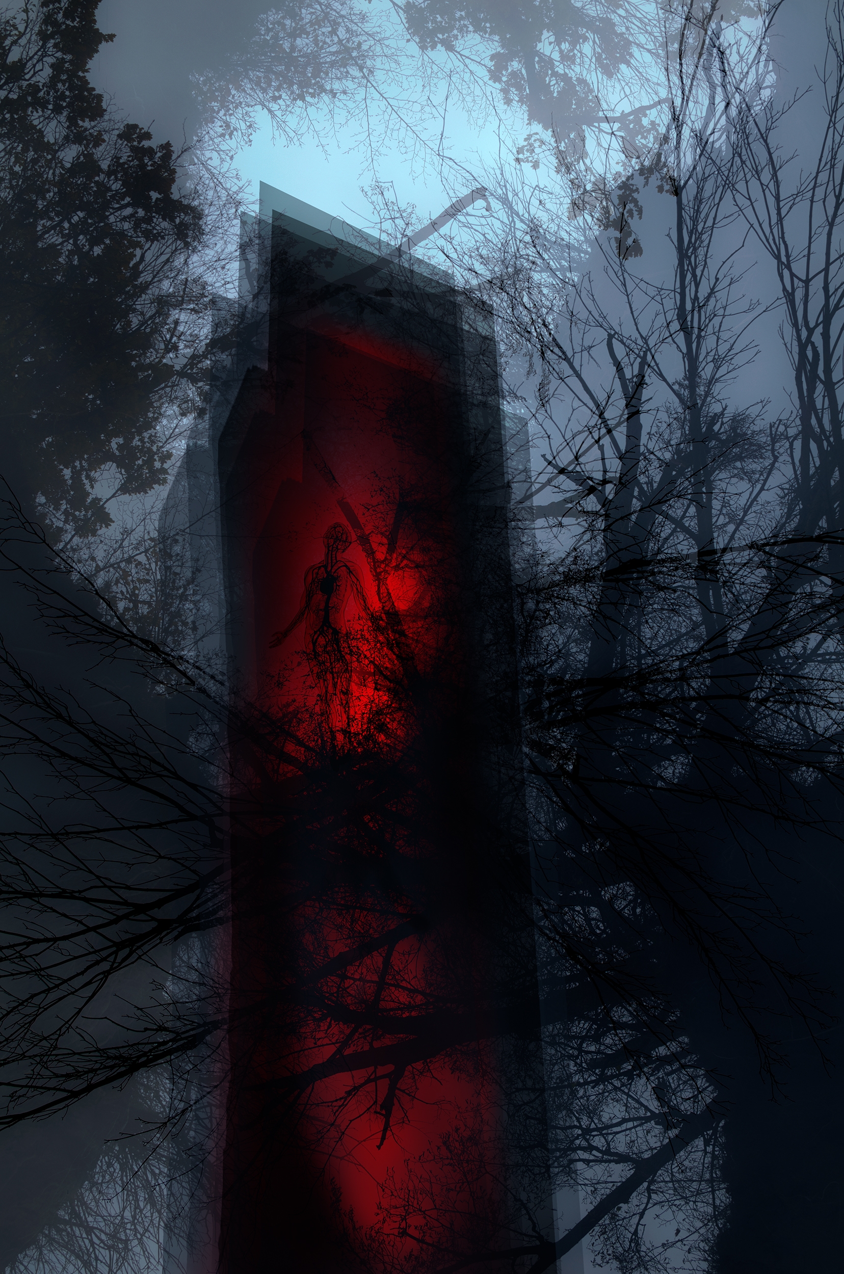
6º Nature Infiltration by Remigiusz Koniecko
This series stages a dense visual dialogue between human presence, architecture, and a wounded landscape, using digital layering almost like a palimpsest of anxieties. The human figure appears semi-erased, absorbed into textures of earth, stone and foliage, as if identity were dissolving into the very terrain we exploit. Chromatically, the work pivots between poisonous cyans, radioactive greens and burning reds that pulse like warning signals inside otherwise muted, ashen environments. The tree and the tower operate as opposing totems: one organic and rooted, the other vertical, rectilinear and ominously lit from within, a beacon of man-made “vibrations” that overpower natural frequencies. Compositional overlaps—transparent silhouettes, duplicated contours, ghostly Vitruvian circles—create a continuous sense of disorientation, echoing the text’s concern with surveillance, illusion and self-estrangement. As a whole, the series feels cohesive in both palette and structure: each image is a different variation on the same question of which nature will prevail, the cosmic one that shelters us or the artificial one we are frantically building around ourselves.
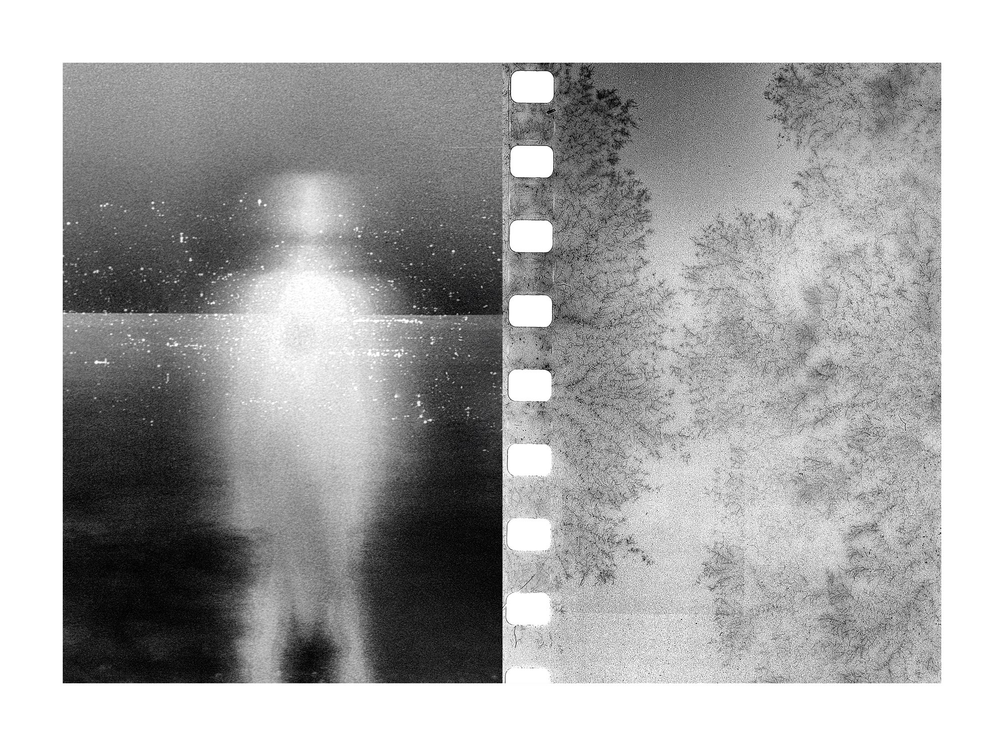
7º Everything is wrong by Mark Tamer
“Everything is Wrong” works as a series of fractured self-portraits of the brain, using the diptych format to stage a dialogue between body, perception and malfunction. On the left panels, ghost-like silhouettes dissolve into grain and flare, figures barely holding their shape against horizons of static: a visualisation of vertigo, sensory overload and a self that keeps slipping out of focus. On the right, the film strip itself becomes co-protagonist — sprocket holes, fungus-like blooms, chemical veils and light leaks read as erratic neural pathways, misfiring synapses and residual pain. The alternation of pure black-and-white with bursts of acidic orange and cyan underlines shifts between numbness and overstimulation. What makes the series strong is how consistently it uses analogue “errors” (dust, scratches, fogging, partial negatives) as meaning, not decoration: the medium’s breakdown is the story. These diptychs don’t just illustrate chronic migraines, they make the viewer feel the instability, while still finding a strange, quiet beauty in the noise.
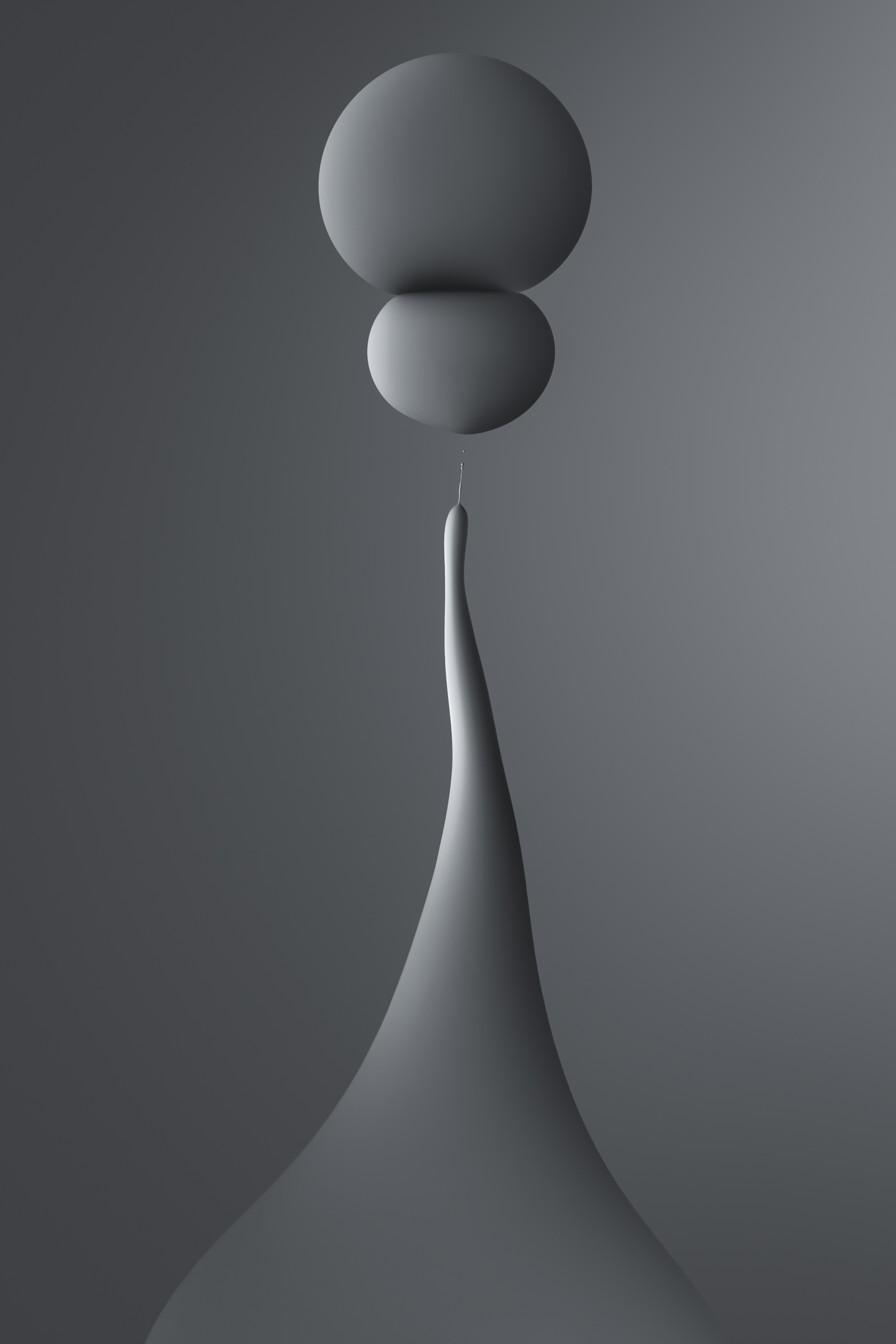
8º Extended by Matt Vacca
“Extended” is a quiet tour-de-force of digital sculpture and balance. Across the series, Matt Vacca reduces everything to three ingredients—matte greyscale, soft directional light and a few bulbous forms—then stretches them into endlessly varied totems. Each image feels like a small act of levitation: masses that should be heavy rise on impossibly thin stems, holding their own weight in a state of poised tension. The gradients are exquisitely controlled, turning simple shapes into volumes that feel tactile and almost haptic, somewhere between polished stone and poured metal. The background stays constant, a neutral fog that lets us focus on rhythm, proportion and the micro-shifts of silhouette. Together, the works read like a choreography of balance and imbalance, a study of how much you can elongate, tilt or compress a form before it collapses—and how elegance often lives right at that edge.
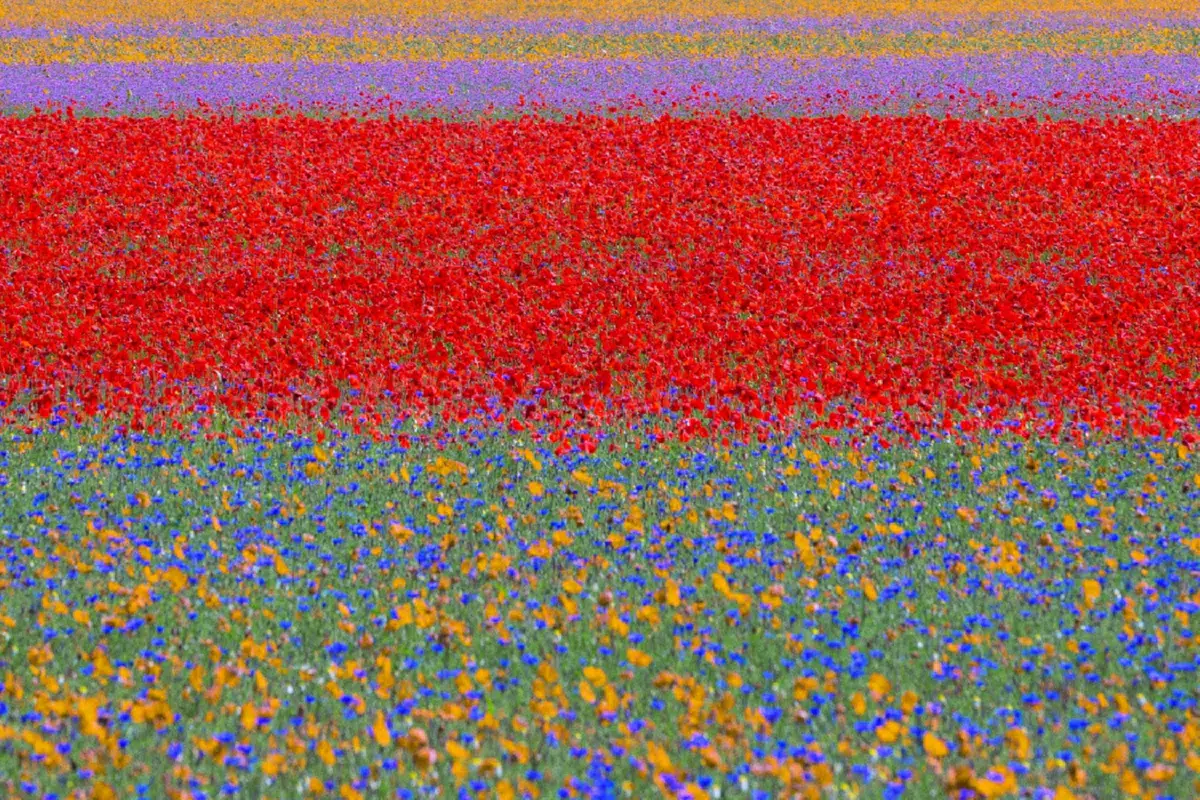
9º Blooming by Gianfranco Bove
This series is extremely coherent: every image reduces the Castelluccio landscape to horizontal bands of colour, almost like a sequence of minimalist paintings. The point of view and focal length seem very similar throughout, so the fields become pure stripes—green, wheat, red poppies, violet, blue sky—only changing their thickness and order from frame to frame. That repetition gives the work a strong rhythmic structure: you can “hear” the landscape as a visual melody of lines. Compositionally, Bove is very strict: no horizon tilts, no diagonals, almost no figurative elements except that lone poppy in the first image, which works as a visual overture and a conceptual key—the individual life inside the colour mass. The colourimetry is clean and saturated but not garish; complementary contrasts (red–green, yellow–blue) are used with a lot of control, so the fields vibrate without collapsing into chaos. Conceptually, Blooming sits between documentary and abstraction: it records a specific place and its post-earthquake resilience but the serial, almost Rothko-like treatment invites us to read the images as studies in repetition, variation and endurance—how a landscape, year after year, rewrites itself in stripes of light and pigment.
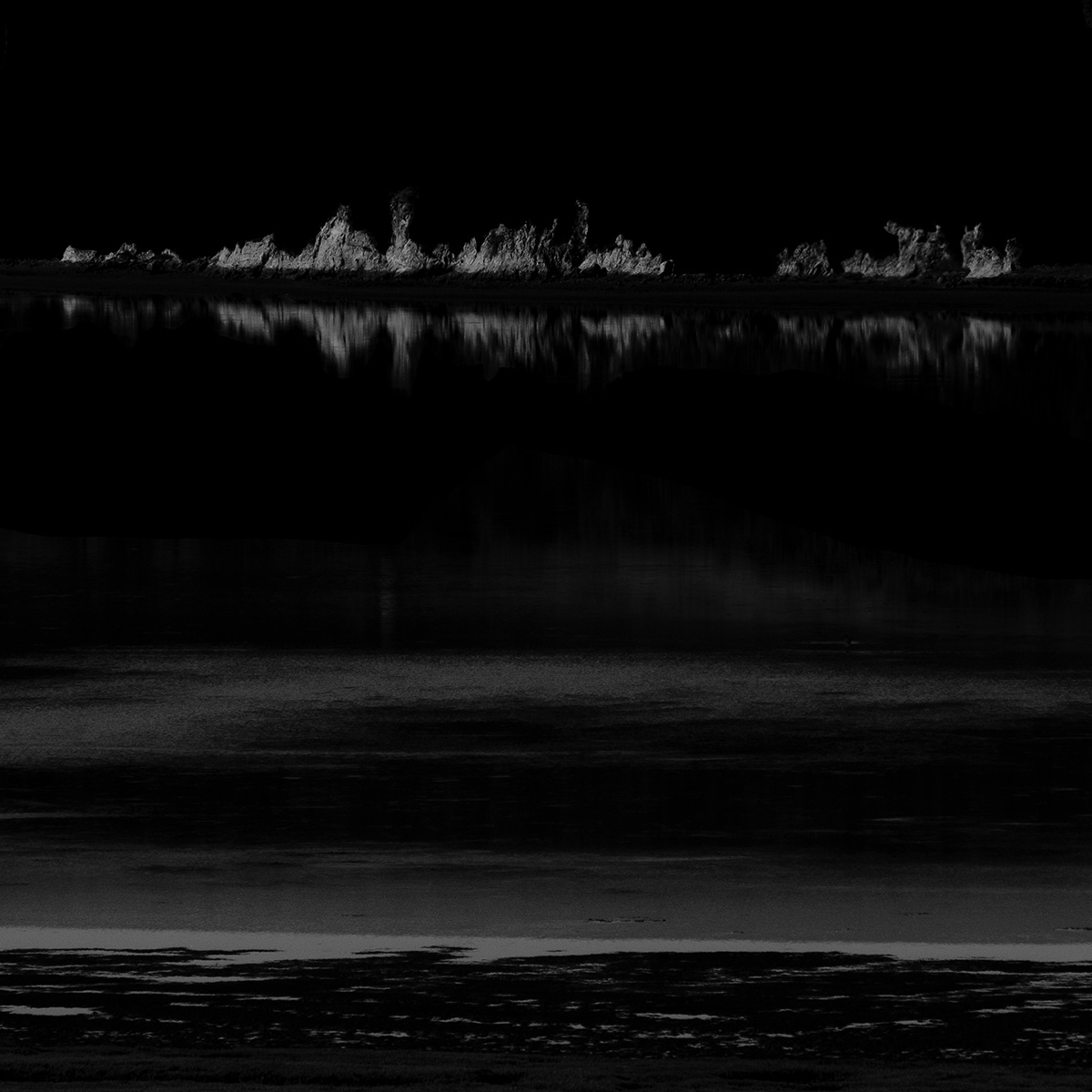
10º Estero by Jacques Garnier
Garnier’s Estero series is one of the most disciplined uses of reduction in this whole selection. The square frames are almost entirely constructed out of black, with delicate bands of mid-grey water and thin white seams of shoreline or channels slicing through them. This extreme compression of tonal range creates a powerful sense of Ma: the subject is not the water itself, but the silent intervals around it. The images hold together coherently as a suite of variations on the same grammar—horizontal strata in the large piece, serpentine calligraphic lines in the smaller ones—so you read them like verses of the same visual poem. Compositionally, the balance between solid black masses and narrow luminous traces is very finely tuned: each image oscillates between calm and latent threat, like a landscape seen in a blackout. Concept and form are perfectly aligned: by stripping away sky, texture and context, Garnier turns the estuary into pure tension between presence and absence, offering an unusually mature, almost musical abstraction of nature.
This ranking is personal but not subjective; it doesn’t list my 10 favorite photos, but rather those I consider the best based on various criteria. I also tried to include the widest possible variety within the context of exceptional quality.

Leave a comment